NEXT STORY
Collaborating with Roald Dahl
RELATED STORIES
Video URL


NEXT STORY
Collaborating with Roald Dahl
RELATED STORIES


|
Views | Duration | |
|---|---|---|---|
| 31. Michael Rosen | 189 | 04:21 | |
| 32. Writing about the death of Michael Rosen's son | 171 | 03:57 | |
| 33. Collaborating with Roald Dahl | 752 | 04:26 | |
| 34. Drawing a caricature of a crocodile | 264 | 04:13 | |
| 35. Roald Dahl and working on The Twits | 1 | 629 | 03:06 |
| 36. Solving the problems surrounding The BFG | 503 | 02:49 | |
| 37. Roald Dahl and working on The BFG | 330 | 05:18 | |
| 38. Illustrating Roald Dahl books even after his death | 455 | 03:23 | |
| 39. Illustrating Esio Trot by Roald Dahl | 282 | 03:51 | |
| 40. A Treasury of Roald Dahl and a book of songs and verse | 161 | 01:21 |


The extraordinary thing was, a couple of years ago, I was sent a manuscript of about a page, by Caroline Royds, of Walker Books, who is… Pam Royds's daughter. And… she knew of course that we'd worked together, and she said, 'Mike has sent me this manuscript', and she just sent me the email, and it said at the top, 'Is this a book?' And she said, we're not… you know, we would like it to be, but we're not quite sure, whether it is. Could you illustrate it? And this is Michael Rosen's Sad Book. And in fact my assistant gave it to me, and said 'I don't know whether you'll want to do this, it's very gloomy'. And of course once I'd read it I knew that I did want to do it very much. I mean it's about his son who died when he was 18, quite suddenly, two or three years before that. And… I mean it was good that I knew Michael, already. I didn't know his son, although I'd drawn him when he was younger, I mean I'd drawn him as a fictional character. But to find the ways of treating that it sort of revived the spirit of those early books, but in a rather different way, because one had to be gloomy, and yet not despairing, which is, I mean… that is in the words, and the… you can unfold the words, it is all there, but the way you design that and deal with it was a very interesting task indeed, and in fact I think, instinctively, I think I'm right in saying this… the first proposals when I'd started doing some rough drawings, were to make it a smaller format book, with some rather tasteful, distinguished typography in it, because it was a sensitive subject. And I think that's what's interesting about, you know, one of the things that's interesting about illustration, it's not just a question of drawing the things that it says in the book, and I think it was important… to me that it was not treated sensitively, if you see what I mean, you know… no, we've got to have a full size book, and the cover will show that it's not for small children. But it's the size of a picture book, but you can see that it's gloomy, in the same way that the typography has to be perfectly straightforward, you know, it's addressed to you, seriously, and you have to take it in that way.
So… that was a wonderful… I mean it was on the basis of a very sad happening, but it was a return to that collaboration, 20 years or more later, which was very, very interesting to me. And now we're about to revive… we did two books earlier on, one was called Don't Put Mustard in the Custard, and one was called You Can't Catch Me. And those treated some of Michael Rosen's poems, but as a coloured picture book. And they've been out of print for a while. And we did them… actually it must be 25 years ago, or thereabouts, so they're… we're just about to revive them now, to re publish them together as one book.
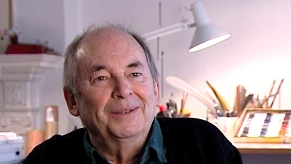
Quentin Blake, well loved British writer and illustrator, is perhaps best known for bringing Roald Dahl's characters to life with his vibrant illustrations, and for becoming the first ever UK Children's Laureate. He has also written and illustrated his own books including Mr Magnolia which won the Kate Greenaway Medal.
Title: Writing about the death of Michael Rosen's son
Listeners: Ghislaine Kenyon
Ghislaine Kenyon is a freelance arts education consultant. She previously worked in gallery education including as Head of Learning at the Joint Education Department at Somerset House and Deputy Head of Education at the National Gallery’s Education Department. As well as directing the programme for schools there, she curated exhibitions such as the highly successful Tell Me a Picture with Quentin Blake, with whom she also co-curated an exhibition at the Petit Palais in Paris in 2005. At the National Gallery she was responsible for many initiatives such as Take Art, a programme working with 14 London hospitals, and the national Take One Picture scheme with primary schools. She has also put on several series of exhibition-related concerts. Ghislaine writes, broadcasts and lectures on the arts, arts education and the movement for arts in health. She is also a Board Member of the Museum of Illustration, the Handel House Museum and the Britten-Pears Foundation.
Tags: Walker Books, Michael Rosen's Sad Book, Don't Put Mustard in the Custard, You Can't Catch Me, Caroline Royds, Pamela Royds, Michael Rosen
Duration: 3 minutes, 58 seconds
Date story recorded: January 2006
Date story went live: 24 January 2008