NEXT STORY

Research into the history of typography
RELATED STORIES

NEXT STORY

Research into the history of typography
RELATED STORIES


|
Views | Duration | |
|---|---|---|---|
| 51. Deciding to make my own typesetting program | 2171 | 02:15 | |
| 52. Working on my typesetting program | 1868 | 02:47 | |
| 53. Mathematical formula for letter shapes | 1519 | 05:41 | |
| 54. Research into the history of typography | 1484 | 01:36 | |
| 55. Working on my letters and problems with the S | 1856 | 04:41 | |
| 56. Figuring out how to typeset and the problem with specifications | 1361 | 06:15 | |
| 57. Working on TeX | 1656 | 02:36 | |
| 58. Why the designer and the implementer of a program should be the... | 1737 | 01:17 | |
| 59. Converting Volume Two to TeX | 1286 | 03:23 | |
| 60. Writing a users' manual for TeX | 1269 | 02:57 |


I decided to go to Stanford instead and… and there… at that time, Stanford had a really great artificial intelligence laboratory up in the mountains presided by… presided over by John McCarthy. He welcomed me to come up there and do everything… anything I wanted and it was… it was a great place to work for the year that I spent. But we didn't have very good… very good equipment compared to what they had at Xerox. We… we had TV cameras that… that I could… that I could use, but if it changed the lighting in the room just a little bit, the letters would change drastically from thin to thick or vice versa. So there was no way to get consistency from one day to the next.
I should… I should mention that my publishers had sent me beautifully printed copies of… of previous editions of my book. Beautiful… what I mean by beautifully printed is, the… the way the books are actually produced… are kind of interesting. With monotype, they… they set in lead and they print one copy, and then they take that one great copy and photograph it and print offset off of the… off of the… the film that they'd… that they’d taken. And that was getting great results. But they had saved the original copy that came off of the lead, so they… so they sent me 50 pages of the… of the real, you know, absolutely definitive versions of what had been used to… to do the previous edition of my book. So I took these to the… to our TV cameras at the AI lab, but I couldn't get any consistency at all. So I… so I didn't know what to do about this. I was talking to Jill and… and she said… well, she could make some good slides, she could… she could photograph these pages and we could make 35mm slides and… and they would be sharp, and we could see what we could do with… with that instead of working with a TV image. So, we tried that and… and then I got my home projector, and I… and I projected the 35mm slide from the end of the corridor on to a wall and so that… so that it… it would be… it would be large enough, and I could trace on a piece of paper what the letter forms were. But the images were very fuzzy. When… when enlarged that much that… you know, we didn't have any way to magnify things now, like film scanners or anything – that didn't exist. Certainly we had no such equipment.
So I'm sitting there looking at these, but trying to trace the letters and figure out what are the shapes and… and suddenly it occurred to me, you know, these letters were actually designed by a human being who had something in mind. And if I could only psyche out what that person had in mind, I could… I could figure… I could write mathematical formulas that would match that person's intentions. This was a weird… a weird dream, but anyway, this was what – I was naïve and I thought this would… this would be fine – and as I had said, when I was in high school, I played a lot with graphs and the… the relationship between shapes and… and mathematical formulas that make those shapes. So… so as I'm sitting there with my… with my pencil and paper trying to… trying to trace the outlines off of these blurry slides being projected on the wall, you know, I noticed a lot of regularities. For example, I noticed that the… the letter n was exactly twice the width of the letter i, and the letter m was exactly three times the width of the letter i. And okay, great, you… you know, there was… there was consistency that… there, that if you have a word like minimum, all of those vertical strokes are coming at exactly the same… the same spacing. Also the u was the… was, you know, the same width as the n. So it… it occurred to me then that if I could figure out, you know, what… what all these principles were that the… that the type designer had done, it wouldn't be too much of a problem to capture that in mathematics.
Okay, so instead of using… so then my whole focus shifted so that I wasn't going to just copy the output of a… of a previous design, I was going to try to… to discover the intelligence behind it, and program the intelligence into the computer, so that you could tell a computer, draw a letter m, and it would draw a letter m. And I… but I could say, now make it a little bolder, now make it a little taller, a little narrower, and it would adapt everything correctly. Now this was a… a weird concept to type designers. Type designers always, you know, approached it with a completely visual approach and no mathematics, probably thank goodness, because they came up with beautiful design, but at any rate, I naïvely thought that this was going to be easy. And, of course, my whole, my goal, it was to… was to… to have Volume Two ready for the printer after my sabbatical year. I had… I had one year to… one year to write these programs and to… and to capture the letter forms and figure out how to typeset them.
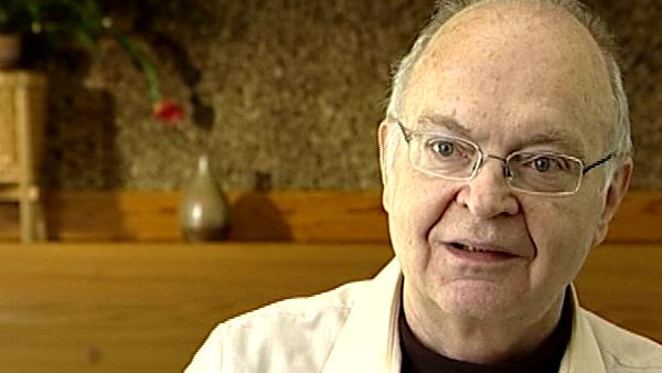
Born in 1938, American computing pioneer Donald Knuth is known for his greatly influential multi-volume work, 'The Art of Computer Programming', his novel 'Surreal Numbers', his invention of TeX and METAFONT electronic publishing tools and his quirky sense of humor.
Title: Mathematical formula for letter shapes
Listeners: Dikran Karagueuzian
Trained as a journalist, Dikran Karagueuzian is the director of CSLI Publications, publisher of seven books by Donald Knuth. He has known Knuth since the late seventies when Knuth was developing TeX and Metafont, the typesetting and type designing computer programs, respectively.
Tags: Stanford University, Xerox Palo Alto Research Center, John McCarthy, Jill Knuth
Duration: 5 minutes, 42 seconds
Date story recorded: April 2006
Date story went live: 24 January 2008